Displayed below are my website designs throughout the years. My work spans across multiple platforms. If available, larger versions of the screencaps are accessible upon clicking the image. Happy browsing!

(inky);paper.org, phase #5

2010-2016

Phase 5, entitled Rule Sick! features characters Scanty and Kneesocks from the anime Panty and Stocking with Garterbelt. I’ve always wanted to experiment with text in layouts, so I aimed for a circus-esque effect after hours of tweaking and trying new fonts. This design went through numerous color schemes until I tried one that really popped! The artist of the two characters featured in the design can be found here.

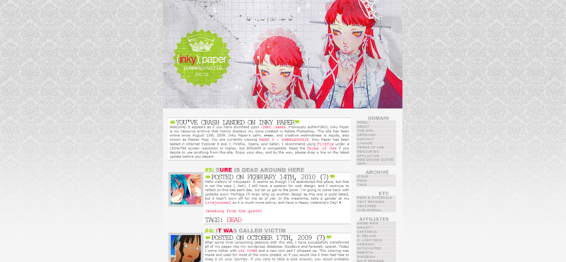
(inky);paper.org, phase #4

April 2010 - November 24th, 2010

Phase 4 features Fran from the animanga series Reborn. After a long hiatus from web design, I thought that I should update with…something! As you can see, I’m a big fan of vibrant color schemes. The blue and purple blended well together, and this design stayed online from April 2010 to November 24th, 2010.

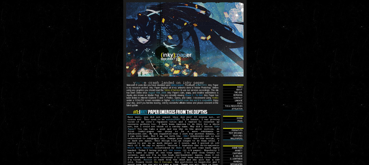
(inky);paper.org, phase #3

2009-2010

This is Phase 3 of (inky);paper, entitled pomme pourrie, meaning “Rotten Apple” in French. After a month’s break of web design, I decided to get back into motion. I carefully selected my choice of colors and I went to work shortly after. This design features Chidori from the Persona series of video games, and it showcases a lovely blend of red, light green, and gray. Compared to my previous two layouts, this design took an interesting departure from my dark-centric color schemes.

(inky);paper.org, phase #2

Septempber 4th, 2009 - October 3rd, 2009

This is Phase 2 of (inky);paper entitled You are the culprit. For this design, I used a game CG of Hisui from the Melty Blood: Actress Again fighting game. When I was brainstorming on what color scheme I should aim for, I stumbled across that image of Hisui. It won me over, and I had to use it for this new design. After coding the design, I was able to design the header. I decided to go with a delightfully dark, pink color scheme. The notebook paper touch to this design topped it all off. This design stayed online from September 4th, 2009 to October 3rd, 2009. It stayed online during my first weeks of 10th grade and I had been suffering with designer’s block at the time. Patience is a virtue!

(inky);paper.org, phase #1

August 16th, 2009 - Septempber 4th, 2009

This is the very first iteration of my current website! Phase 1 of (inky);paper, entitled To Rot. In the beginning of my designing process, I tried many approaches for the main image. I wanted to present a darker, blue feel to the design. After searching through my collected art pieces, I found an older image of an original character called Black Rock Shooter illustrated by the artist Huke. The piece was perfect in what I wanted to display. After some time, I achieved the overall design and atmosphere I wanted with Photoshop. The coding and color scheme was a roller coaster ride. At first I used blue, neon green, red, hot pink, and white. When I looked at the result I was pleased, but then again displeased. So, after narrowing down my color options, I selected only blues and neon green. In the end, I am happy with the result. This version stayed online from August 16th to September 4th, 2009.

Two later versions of ashikiyoko.net

2009


Prior to the transformation into inkypaper.org, my very first website was called Ashikiyoko, established in 2007. The name is a botched combination of Japanese words I discovered in Google Translate, and while I look back on it with a chuckle, I would not be where I am today without experimenting with my first site. Above are two of my later designs for the site prior to the transformation and re-structuring of it into Inky Paper. Both designs feature the character CC from animanga series Code Geass. The first screencap is version 18 of my site, entitled Monday Asteriod, wonderfully vibrant with an explosion of colors. The second screencap is version 21 of the site, which stayed online from from July 9th 2009 to August 10th 2009 and displays the beginning of my exploration into darker color schemes.

Layouts for Livejournal, Dreamwidth, & Plurk

2011


Aside from managing inkypaper.org, I joined Livejournal's community and created a few themes for that platform during its heyday. All three designs were crafted for Livejournal, shared with the community for public use, and I gained a sea of praise for my contributions. These designs were also combatible with Dreamwidth's theming system. The top left theme is entitled Chordaroy, the top right theme is entitled Ancestress, and the bottom left theme is entitled Bat's Mouth. Live, static previews of Chordaroy and Bat's Mouth have been preserved for your viewing! Many people who used Livejournal also used a site called Plurk.com to communicate with each other in real time, and I also used it to chat with friends. The bottom right design was crafted for Plurk.com for public use.

CHEER @ Dreamwidth.org

January 6th, 2012 - June 29th, 2013

After Livejournal experienced a massive migration of users to other social media platforms, one of the sites that ex-Livejournal citizens used was Dreamwidth, which is a very similar journal site. I lightly used my personal Dreamwidth account and primarily used it to continue to post icons that I made in Adobe Photoshop! Displayed above is the design for it, and the site itself can be viewed here. A live, static preview may be viewed here.

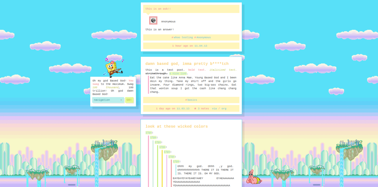
Theme for Tumblr: Aquanaut

November 6th, 2013


This was an expansive theme I made available for public use on the website Tumblr with so many editable options that the user could produce hundreds of variations of a new theme with my coding. As of March 21st, 2017, the theme has received over 5,000 hits on the website and was widely used and circulated.

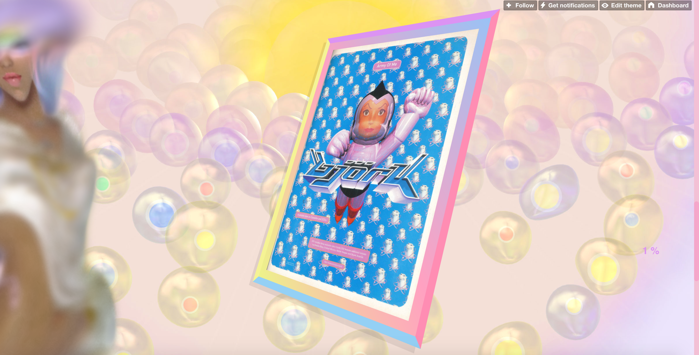
Theme for Tumblr: Sterilize

2014 - February 2017


A highly interactive theme for tumblr I made exclusively for personal use. It featured many CSS3 transformations when the mouse hovered over elements and was a quirky design that I'm most proud of. When creating it, I wanted to channel the feeling of old geocities sites. The background features art from Mariko Mori and the image on the left side features art from RGUS that I edited in Photoshop.